
Paragon Pic Logo CIRCLE INVERTED FOR RELEASE V1

Paragon Pic

They say a picture is worth a thousand words. Well, data visualization is worth at least that much. Paragon Pic makes health policy easier to see and understand by demonstrating with images what researchers would normally try to explain with a lecture or text. Check for a new figure every week.

They say a picture is worth a thousand words. Well, data visualization is worth at least that much. Check for a new figure every week.

Filters
Initiative
Reset
Topic
Reset
Only the first 250 values are displayed.
Location
Reset
Media Outlet
Reset
3AW Medicare Site Of Service Payment A0wUU000005fkX3YAI

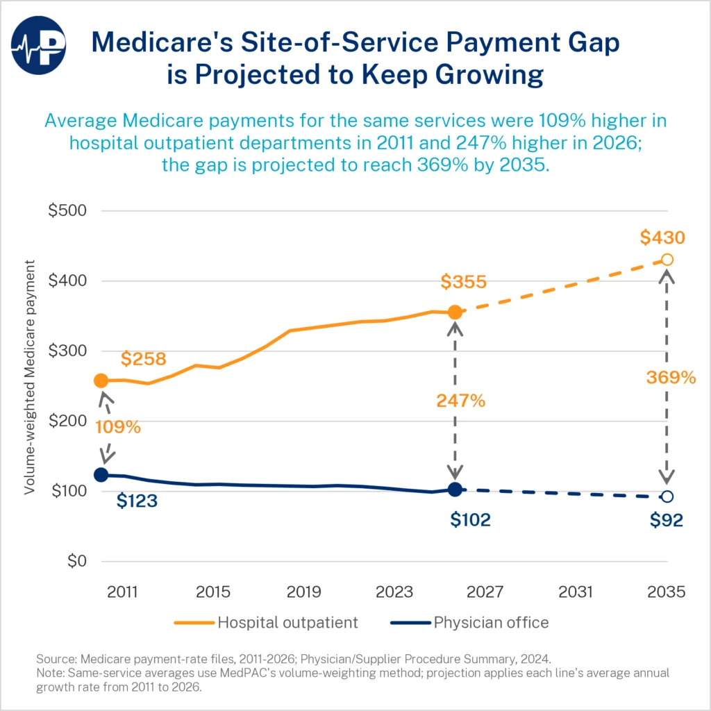
Medicare’s Site-of-Service Payment Gap is Projected to Keep Growing

Medicare often pays more for the same service when administered in a hospital outpatient department (HOPD) than an independent doctor’s office. This Paragon Pic shows that the disparity between the two sites of service is wide and growing.

We analyzed data for 4,281 services across HOPDs and physician offices and found that Medicare’s site-of-service payment gap has grown sharply. In 2011, HOPDs received 109 percent more than physician offices for the same services on a volume-weighted basis; by 2026, they received 247 percent more. In nominal dollar terms, average HOPD payments rose from $258 to $355, while physician-office payments fell from $123 to $102. If this trend continues through 2035, HOPDs will receive $430 on average while physicians’ offices will only receive $92–a 369 percent advantage for hospital-based care for services that are virtually indistinguishable.

This gap is the result of two separate payment systems that Medicare uses to pay for services. The first is the Outpatient Prospective Payment System (OPPS), which ostensibly compensates hospitals for the capital and labor expenses involved in providing services. The second is the Physician Fee Schedule (PFS), which pays physicians for services rendered, regardless of where that service is performed. A service that is performed in a HOPD by a physician will receive two payments: an OPPS payment for the hospital—often called a “facility fee”—and a PFS payment for the physician. Meanwhile, that same service performed by a physician in an independent physician’s office will only receive one payment from the PFS. Medicare pays a higher non-facility PFS rate than the facility PFS rate because the physician incurs practice expenses that the hospital otherwise bears. However, the OPPS facility fee that hospitals receive is generally equal to or larger than the PFS rate. Because most hospital-employed physicians are salaried, hospitals usually receive both the OPPS and PFS payments. As demonstrated in the Paragon Pic, the combined hospital and physician payment typically exceeds the office-based physician payment by a wide margin.

Medicare awards this extensive reimbursement for outpatient procedures even though outpatient facilities are relatively low-cost compared to inpatient facilities. The Medicare program functionally recognizes this fact in the slightly larger PFS rate paid to independent physicians, who must maintain a facility that covers the same services as a HOPD. This payment differential is effectively a subsidy benefiting hospitals that inflate operational costs and reducing their incentives to improve efficiency. To make matters worse, Medicare automatically adjusts the OPPS facility fee for inflation but does not do the same for PFS payments to physicians due to the different designs of the payment systems.

These payment differentials create significant distortions, including incentives for vertical consolidation. They also mean more costs for taxpayers, and the distortions and waste will only grow the longer Congress allow them to persist. Introducing a Medicare site-neutral payment reform would reduce incentives for hospitals to acquire physician practices and lower costs for patients and taxpayers.

19MH PIC Almost Entire Obamacare Premium Inc A0wUU000005hNkrYAE

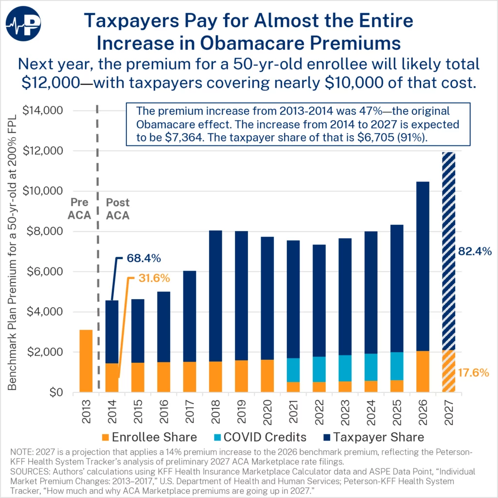
Taxpayers Pay for Almost the Entire Increase in Obamacare Premiums

Obamacare, including its perverse subsidy design, continues to drive up insurance premiums and health care costs by largely insulating subsidized enrollees from premium increases. The premium increases for Affordable Care Act (ACA) plans are concealed from enrollees since the enrollee’s share is capped at a percentage of their income. This subsidy design means that when insurers raise premiums, the cost is borne by the taxpayer.

This Paragon PIC illustrates how the cost of a benchmark ACA premium has been divided between taxpayers and a representative enrollee—a 50-year-old with income at 200 percent of the federal poverty level—since the exchanges began. The orange portion represents the enrollee share, and the navy amount represents the share borne by taxpayers.

The ACA’s major coverage provisions took effect in 2014 and significantly increased individual market premiums. In that first year, taxpayers covered 68 percent of the premium. Between 2014 and 2020, the annual premium increased from about $4,500 to $8,000. Yet, the enrollee amount stayed nearly flat during this period as taxpayers absorbed almost the entire premium increase. By 2020, taxpayers covered 80 percent of the premium—a significant increase from 2014.

From 2021 to 2025, COVID-era subsidy boosts (shown in light blue) replaced much of the enrollee share with expanded subsidies. That increased the government’s share of the premium to 93 percent of the cost. Despite the COVID subsidy boosts expiring after 2025, the underlying ACA subsidy still covers more than 80 percent of the premium for this representative enrollee.

Some reports show preliminary premium increases of 14 percent in 2027, prompting claims that enrollees will face significant cost increases. As this PIC shows, that narrative is misleading. For the representative enrollee shown here, the annual out-of-pocket premium will increase by only about $40 from 2026 to 2027—roughly $3 per month. The taxpayer’s share will increase by $1,426. For this enrollee, the government will pay more than 82 percent of the premium in 2027.

Moreover, this representative enrollee pays a larger share of the premium than most subsidized marketplace enrollees. Approximately 73 percent of 2026 ACA open enrollment period sign-ups claimed income below 200 percent of the federal poverty level.  Because premium contributions decline as income falls, most subsidized enrollees pay even less toward their premiums—and taxpayers pay even more—than this figure illustrates.

3MH ACA Spending 64 Percent Higher Tha COVID A0wUU000005SJeLYAW

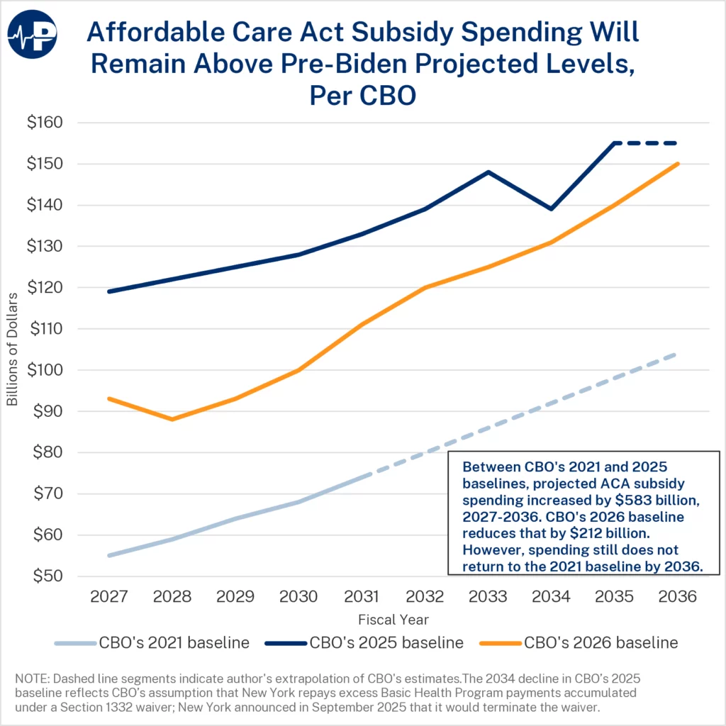
Affordable Care Act Subsidy Spending Will Remain Above Pre-Biden Projected Levels, Per CBO

CBO’s most recent estimates show that federal spending on Obamacare subsidies will remain well above pre-pandemic estimates. The One Big Beautiful Bill made important changes to improve the integrity of the exchanges.

This is especially important given the massive extent of improper enrollment in the exchanges. The CBO’s 2026 baseline projection reduces the rate of growth of Obamacare spending by $212 billion over ten years, 2027 to 2036, versus the baseline projection published in 2025. However, the 2025 baseline for the same period jumped by $583 billion from the 2021 baseline.

The main driver of the Biden spending increase was a set of administration policies that prioritized increasing Obamacare enrollment at any cost along with an expansion of subsidies as a COVID-era boost. These policies weakened program integrity measures, stopped income verification for many enrollees, and essentially opened a year-round enrollment period—and created large incentives for enrollees, brokers, and insurers to misstate applicant income to maximize subsidies. Paragon estimates that 6.2 million people were improperly enrolled in Obamacare in 2026.

(The 2021 baseline stops in 2031; and the 2025 baseline stops in 2035.  Those baselines are extrapolated through 2036 using common-sense assumptions, as indicated by the dotted line in the figure.)

7MH Medicaid Managed Care A0wUU000005dVibYAE

Medicaid Managed Care Now Accounts for the Majority of Medicaid Spending

This PIC shows the growth in Medicaid managed care over a 25-year period from 1999 through 2024. By 2021, Medicaid managed care accounted for more than half of all Medicaid spending. In 1999, payments to managed care organizations (MCOs) represented just 12 percent of Medicaid spending. By 2024, that share had climbed to 54 percent, roughly $490 billion of the program’s $909 billion in total outlays. The figure traces this transformation, with managed care spending (dark blue) steadily displacing traditional fee-for-service and other Medicaid spending (light blue). The trajectory steepens notably after the passage of the Affordable Care Act in 2010, with a further steepening after the ACA Medicaid expansion took effect in 2014. As we have previously shown, the ACA has been very profitable for health insurance companies.

This dramatic shift raises an important question: Has Medicaid managed care actually worked? When states began moving enrollees into MCOs, advocates argued that private insurers would coordinate care better, curb unnecessary spending, and improve quality. Yet after three decades of expansion, the evidence remains remarkably weak. The Congressional Budget Office found no consistent evidence that managed care improves outcomes, and a recent paper by Chris Pope of the Manhattan Institute concludes the case for managed care is thin.

Oversight has also failed to keep pace. Nearly half of MCO filings are incomplete, and medical loss ratio rules meant to keep spending on care rather than profit go largely unenforced. Meanwhile, state-directed payments, which are large payments that states make to hospitals through MCOs, ballooned from two states in 2016 to a projected $124 billion across 39 states by 2025. State-directed payments increasingly functioning as corporate welfare to politically powerful providers. The One Big Beautiful Bill capped these payments at Medicare rates. While those reforms are important, there are additional reforms needed to bring greater transparency and accountability to Medicaid MCOs.

2AW HealthCare Enrollment Above 2020 A0wUU000005ahMvYAI

HealthCare.gov Enrollment Remains Far Above 2020 Levels

In The Persistent Obamacare Enrollment Fraud, we estimated 6.2 million improperly enrolled Obamacare enrollees after the 2026 open enrollment period. We define improper enrollment as the number of enrollees claiming income in the 100-150 percent Federal Poverty Level (FPL) group that exceeds the number of potential enrollees that plausibly have that income. Enrollees claiming income in the 100-150 percent FPL group receive the largest subsidies, with most of them qualifying for zero premium bronze or gold plans as well as heavily discounted silver plans. These “free” plans create strong incentives for brokers and other intermediaries to place consumers into the 100–150 percent FPL group, even when applicant income or eligibility information does not support that classification. Insurers receive more subsidy dollars and brokers receive greater commissions. Large scale improper enrollment has also led to significant number of phantom enrollees in the exchanges.

The enrollment data continue to show the scale of the problem. As this Paragon PIC shows, HealthCare.gov enrollment remains far above 2020 levels, with the largest increase concentrated in the 100–150 percent FPL group. Enrollment in this category rose from about 3 million during 2020 open enrollment to more than 10 million during 2026 open enrollment. Of the total enrollment increase from 2020 to 2026, approximately 67 percent was in the 100-150 percent FPL group.

7AW Child Medicaid And CHIP Enrollment A0wUU000005aQynYAE

Child Medicaid and CHIP Enrollment Remains Above Pre-Pandemic Levels in 2026

This PIC shows that child enrollment in Medicaid and CHIP remains above its pre-pandemic level as a share of the total population aged 0-18. In January 2020, 45.3 percent of children were enrolled in Medicaid or CHIP, nearly identical to the average level of 45.4 percent from 2018 to 2019. In January 2026, the last month for which complete data is available, that share was 47.3 percent, a two percentage-point increase. Enrollment rose sharply during the pandemic because federal law largely prohibited states from removing Medicaid enrollees, even when they were no longer eligible. This led to dramatic enrollment growth, as shown in the figure. At its peak in 2023, Medicaid child enrollment and CHIP enrollment together covered more than half of all children. Since 2023, the share has declined, but it is still greater than pre-pandemic levels.

This historical perspective is important context for assessing recent claims that declining child enrollment in Medicaid/CHIP reflects children losing health coverage due to “spillover effects” or “chilling effects” from the program integrity reforms in the One Big Beautiful Bill (OBBB) and other actions of the Trump administration. As Paragon has argued, enrollment declines in Medicaid/CHIP after 2023 should be interpreted alongside the unwinding of pandemic-era continuous coverage rules, duplicate enrollment cleanup, demographic change (particularly the decline in the fertility rate and number of children in the U.S. during this period), and normal eligibility redeterminations. Until these common-sense explanations are explored empirically, claims that the OBBB is driving up the number of uninsured children are speculative and unsupported by the available evidence. Moreover, it is crucial not to conflate Medicaid/CHIP enrollment with insurance coverage, access to care, or health outcomes.

(It is also important to note that the population estimates we use from the Census Bureau include all children living in the U.S., regardless of immigration or legal status. Since undocumented children are ineligible for Medicaid/CHIP coverage in most states, the PIC slightly understates the share of eligible children enrolled in Medicaid/CHIP.)

Overall, the figure shows that child Medicaid and CHIP enrollment remains elevated relative to historical averages, even after the decline associated with the unwinding of continuous coverage requirements. Rather than showing a collapse in child coverage in public programs, the data are consistent with enrollment gradually normalizing after the significant pandemic-era expansion.

8.1MH SEIU New York Diagram A0wUU000005KTJ7YAO

How Medicaid Funds for Nurse Training Were Diverted to Union Benefits and Lobbyists

Waste, fraud, and abuse in Medicaid benefit bad actors at a steep cost to the truly vulnerable and hard-working Americans. But as CMS Director, Dr. Oz recently noted, the spoils of this manipulation often benefit the politically connected, like unions.

New York State offers a prime example of how unions leverage Medicaid dollars for their own gain. As Bill Hammond of the Empire Center has documented, hundreds of millions of Medicaid dollars intended to improve nursing home care were diverted to increase union benefits instead.

Hammond first examined the annual benefit reports, audits, and state plan amendments (SPAs) and found that New York nursing homes worked with a labor union to redirect funds for improving patient care into employee benefit funds. This money was meant for “training,” but instead, the nursing homes sent a large portion of the money to a benefit fund affiliated with the 1199 Service Employees International Union (SEIU). In exchange, the union reduced how much the nursing homes would have to spend on their employees’ benefits. One of those funds even redirected some of that money to an advocacy group through which unions and hospitals collude to push for more Medicaid funding to feed this arrangement.

How do we know? It’s all in the audits.

How federal taxpayer dollars end up in New York union hands

The federal government and states both finance Medicaid. The federal government reimburses states at a percentage known as the federal medical assistance percentage (FMAP). In the case of New York, its FMAP is 50 percent for traditional enrollees—the elderly, the disabled, children, and pregnant women. During this period, the effective aggregate federal share of New York Medicaid spending was over 60 percent.

In 2015, New York created the “Advanced Training Initiative” (ATI). On paper, the program sounded reasonable: train nursing home workers to identify early signs of patient decline. New York’s 2015 SPA states that the “participating providers” would have to “develop (or continue) a training curriculum” to “help staff identify changes in a resident’s [status] that could lead to hospitalization.” The SPA only mentions unions in its appendix, noting the programs would be “developed in cooperation between Nursing Home providers and union representatives.” But the SPA appendix makes no mention of benefit funds. The state told federal officials it would spend $46 million annually and sought the 50 percent federal match.

But that’s not where all the money went.

Large portions of ATI money were routed into union-affiliated benefit funds. Specifically, both funds are affiliated with 1199 SEIU, the largest health care union in the United States, which Stephen Eide and Daniel DiSalvo referred to as the “union that rules New York.” Those funds’ own financial filings show the money wasn’t primarily used for training. It was used to offset nursing homes’ contributions to their employees’ benefits through two funds.

The Greater New York Benefit Fund (GNYBF) received $207 million from ATI from 2015 to 2024. The National Benefit Fund for Health and Human Service Employees (NBF) received at least $26 million from 2015 to 2018, with additional amounts likely received in subsequent years. Combined, these two funds received at least $233 million from 2015 to 2024—more than half of the ATI’s cumulative $460 million funding during that period.

Nursing homes sent ATI money to the union benefit funds in exchange for lower required contributions to employee benefit plans. The money then showed up on balance sheets as assets available to pay benefits, not as expenditures on training programs. One of those funds, NBF, even spent an unknown amount on the Healthcare Education Project (HEP)—a lobbying and advertising operation jointly run by the union and the hospital industry. HEP has engaged in multimillion-dollar ad buys as well as political campaigns and advocacy efforts to push for increased Medicaid spending.

To recap: Medicaid dollars meant for training were routed into union benefit funds. But that’s not what CMS approved. The SPAs described a straightforward training initiative to improve patient care. It mentioned unions only as partners in developing training programs and said nothing about routing hundreds of millions of dollars into union benefit funds.

As part of its war on fraud, CMS should investigate whether New York used Medicaid funds in a manner inconsistent with the SPA approved by the federal government. Medicaid dollars should improve patient care—not subsidize union benefit funds or finance political advocacy.

4AW Obamacare Expansion Enrollees One Third A0wUU000005VMuDYAW

Medicaid Expansion Enrollees Represent Nearly One-Third of Enrollees in Expansion States

Medicaid was originally created to serve society’s most vulnerable Americans—pregnant women, children, seniors, and people with disabilities. Obamacare dramatically expanded the program to millions of able-bodied, working-age adults and created powerful incentives for states to maximize expansion enrollment. For every $1 states spend on expansion adults, the federal government contributes roughly $9—far more generous than the federal match for traditional Medicaid populations.

This Paragon PIC shows the share of Medicaid enrollees classified as ACA expansion adults by state. On average, expansion adults account for roughly 30 percent of Medicaid enrollment in expansion states, and they represent more than 40 percent of Medicaid enrollees in several states, including Oregon, Louisiana, and Nevada.

These figures help illustrate how large the Obamacare expansion population has become relative to Medicaid’s traditional populations. In many states, healthy, working-age adults now comprise between one-quarter and one-half of all Medicaid enrollees.

The expansion’s financing structure also creates significant program integrity concerns because states receive a much more generous federal match for expansion adults than for traditional enrollees. As prior Paragon research has shown, some states may have incentives to classify traditional enrollees as expansion adults to secure enhanced federal reimbursement.

Research also suggests that Medicaid expansion has strained access to care for traditional Medicaid enrollees while delivering relatively limited value for taxpayers and beneficiaries. Studies have found that expansion can increase wait times, reduce access to providers, and generate relatively low value relative to program costs.

6MH PIC Fig2 Hospital Financing A0wUU000002vAvyYAE

On Average, Hospitals Earn Marginal Profits from Treating Medicare Patients

The American Hospital Association recently criticized the claim in Paragon’s new study, The Hospital Cost Crisis: How Government Policies Drive Consolidation, Undermine Competition, and Fuel Soaring Prices, that Medicare is consistently profitable for hospitals. Hospitals would not have continued to treat Medicare patients for 60 years if doing so consistently resulted in losses.

Hospitals’ Medicare marginal profit is consistently positive, as shown in this PIC. The Medicare marginal profit exceeded 10 percent in 2014 and was about 9 percent in 2015. From 2016 through 2019, hospitals’ Medicare marginal profit was 8 percent. In 2020, Medicare marginal profit dropped to 5 percent, returned to 8 percent in 2021, dropped to 5 percent again in 2022, and remained positive in 2023 (the most recent year for which it is reported).

Hospitals emphasize a different financial metric—operating margin—that often shows losses. This second measurement allocates hospitals’ heavily inflated fixed costs to Medicare patients, resulting in operating losses from Medicare.

To understand the difference, let’s look at an average U.S. hospital. The hospital receives gross payments of $100 million annually from Medicare claims, having treated 5,000 Medicare patients with average gross revenue of $20,000 per patient. The hospital submits claims with charges based on its costs. Most of these costs vary: These costs are only incurred when the hospital treats a Medicare patient. For the 5,000 patients treated, these costs add up to $90 million.  The hospital’s marginal profit is $10 million, or 11 percent. In other words, Medicare patients contributed to overall profits for the hospital.

However, the hospital would incur substantial fixed costs even if it treated no Medicare patients. These costs are fixed no matter how many patients are treated and, in this example, total $22 million. When those fixed costs are allocated to Medicare patients, it results in operating costs of $112 million, and a loss of $12 million, or 12 percent. Needless to say, hospitals only highlight this latter measurement in their advocacy. There is nothing wrong with this measurement: It is standard business accounting. However, as an advocacy tool it leads to misguided policy conclusions.

Medicare payments change according to a market basket that largely accepts, rather than negotiates, hospitals’ total costs. This weakens incentives for hospitals to reduce fixed costs over the long term and likely helps explain why productivity gains have been so elusive in the hospital sector.